PRIMARY ISSUES TO SOLVE
1. Clarity: A straightforward website structure that also clearly communicates who CMREN is
2. Consistency: Consistent brand system applied throughout the website
3. Sustainability: Designed with longevity in mind, allowing easy updates and long-term usability
2. Consistency: Consistent brand system applied throughout the website
3. Sustainability: Designed with longevity in mind, allowing easy updates and long-term usability
PREVIOUS WEBSITE
Their current website was packed with so many different pages that being on the website was overwhelming. Key information about CMREN’s role was also either hidden or unclear, leading to the misconception that CMREN is a recovery service itself, rather than a network connector of recovery resources.

AUDIENCE CLARITY
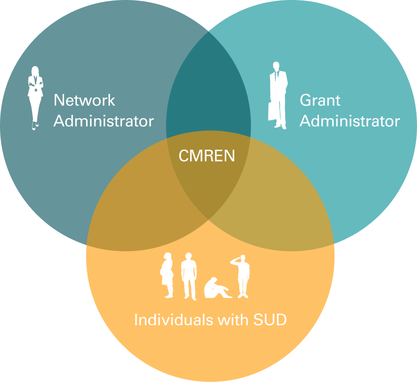
The website’s language revealed confusion around who their main audience/s are. Through our research, we identified two key audience groups for CMREN:
Primary: Network and Grant Administrators
Secondary: Individuals with Substance Use Disorder
Primary: Network and Grant Administrators
Secondary: Individuals with Substance Use Disorder
The site mainly catered to that secondary audience, overlooking the needs of its core stakeholders.
NEW WEBSITE SCREEN FLOW
Keeping in mind that CMREN’s main audience is the administrators who give them grants or potential network partners, we simplified the site down to 5 pages: Home, About, Partners, News, and Service Directories.
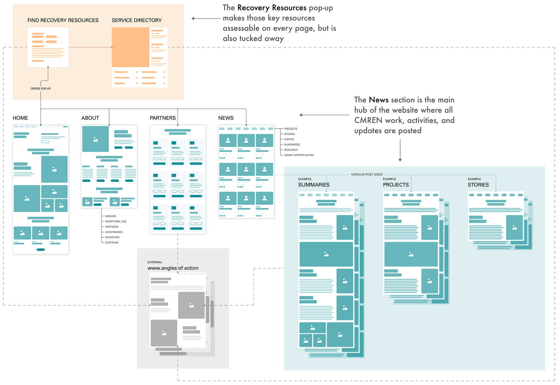
The website was developed using Wix, with all solutions carefully tailored to fit within the platform’s unique limitations and capabilities.
You can find the live website at cmren.org
You can find the live website at cmren.org
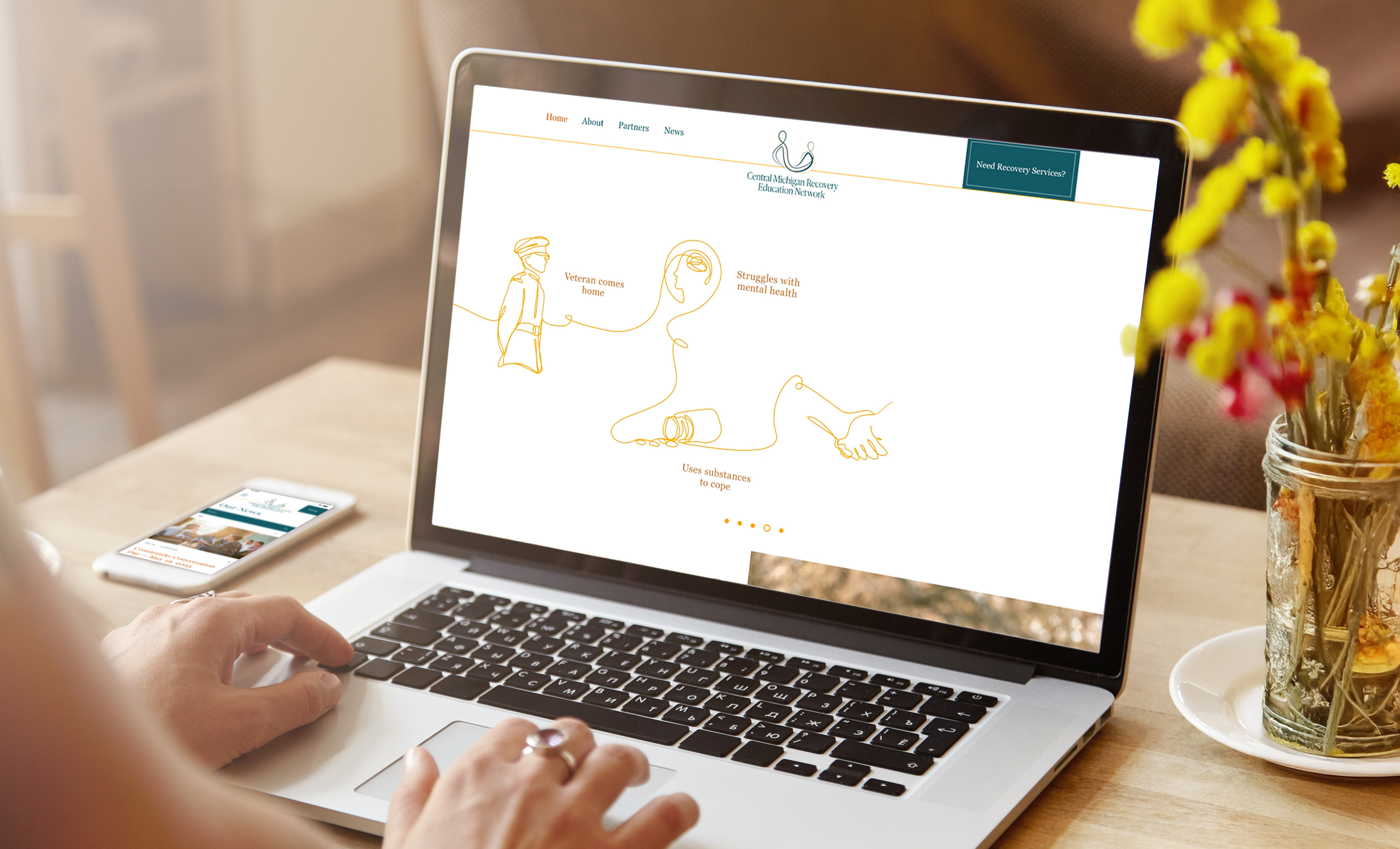
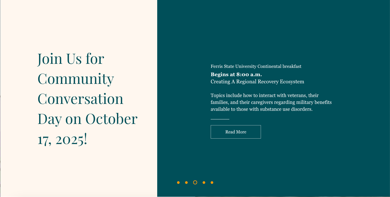
CMREN HOMPAGE
How it solves:
1. Clarity: The homepage immediately communicates who CMREN is through the opening paragraph and story animations at the top.
2. Consistency: The new brand identity system is seamlessly integrated into both the animations and overall site design.
3. Sustainability: The top carousel offers a simple way to showcase key events, while the "What's New" section at the bottom automatically updates as posts are published.
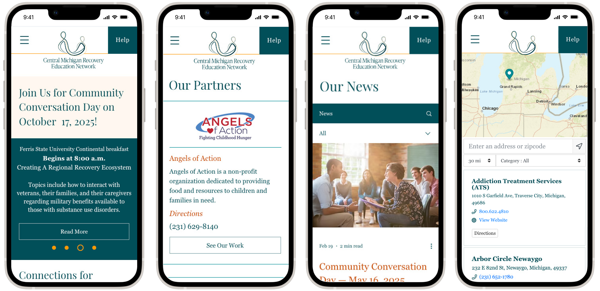
The homepage features a carousel slideshow at the top, showcasing story animations that highlight CMREN’s role in recovery journeys and provide reminders for upcoming events.
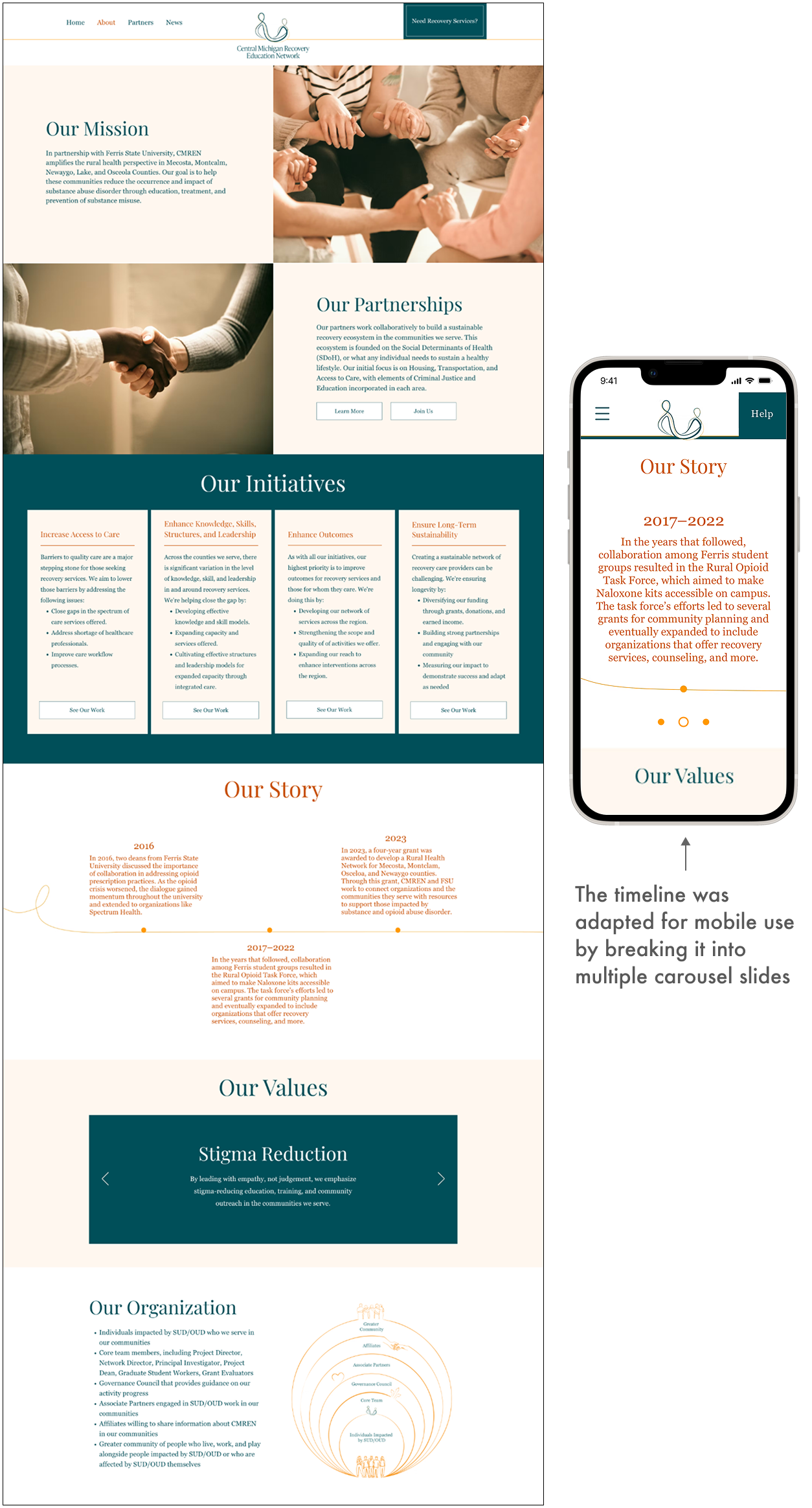
ABOUT CMREN & THEIR PARTNERS
How it solves:
1. Clarity: The About page further clarifies who CMREN is through their mission, initiatives (which shapes everything they do), timeline, and the organization diagram.
2. Consistency: The new branding system is consistently displayed through the graphics and diagrams used.
3. Sustainability: Adding onto the timeline is easy through it being in a slideshow format.
How it solves:
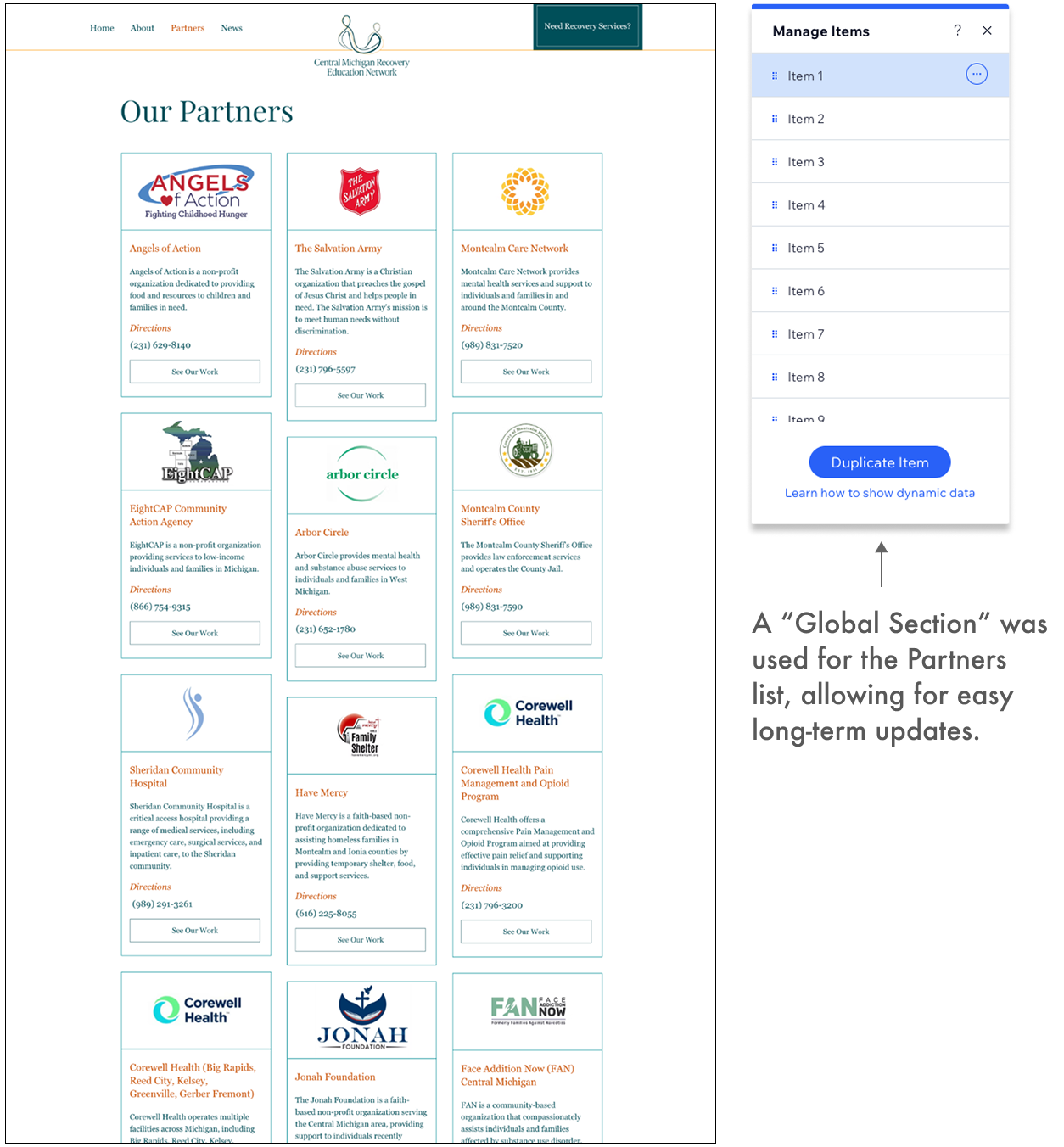
1. Clarity: The partners page clearly displays all of CMREN’s recovery partners, what they do, and how to access or get in contact with them.
3. Sustainability: Adding or removing a partner is easy to maintain and update long-term, through being in a Global Section module.
1. Clarity: The partners page clearly displays all of CMREN’s recovery partners, what they do, and how to access or get in contact with them.
3. Sustainability: Adding or removing a partner is easy to maintain and update long-term, through being in a Global Section module.
THE NEWS SECTION
How it solves:
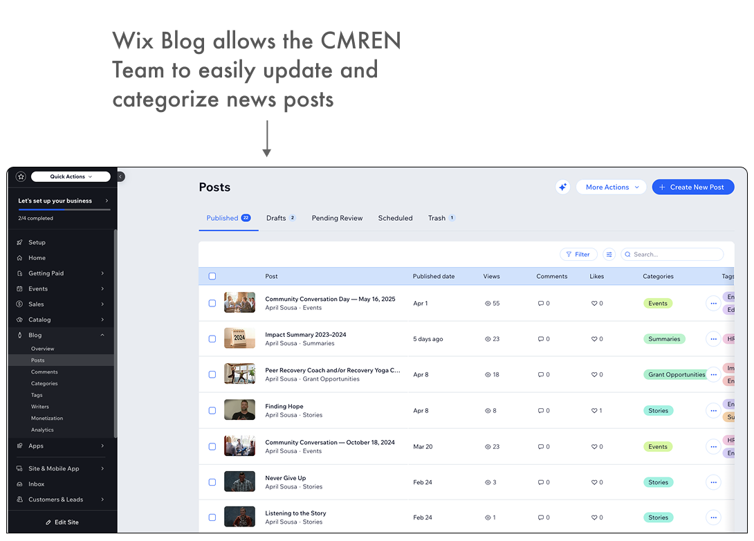
1. Clarity: Instead of CMREN activities being scattered around the website, everything they do is in one spot with categories and tags to help further direct in-page navigation.
3. Sustainability: Adding and removing posts or tags/categories is easy through the section being set up through the “Wix Blog” feature.

NEWS POST TYPES
How it solves:
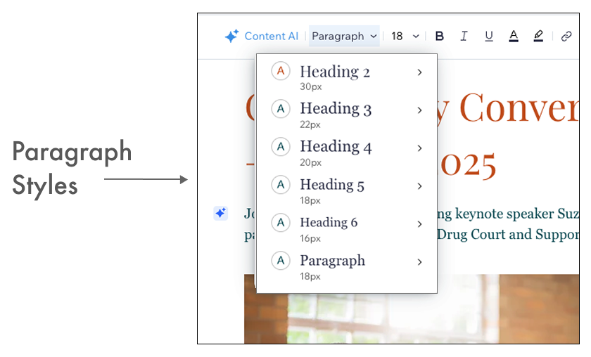
1. Clarity: Rather than relying on images of flyers, posts now feature written content. The Impact Summary consolidates CMREN’s activities for the fiscal year into a single, easy-to-read post.
2. Consistency: All posts follow a unified format through the Wix Blog feature, using a consistent layout and brand system.
3. Sustainability: With predefined layout and paragraph styles, new posts can be added easily and quickly. The Impact summary also allows for past CMREN work to be displayed without overwhelming the News section with more individual posts.

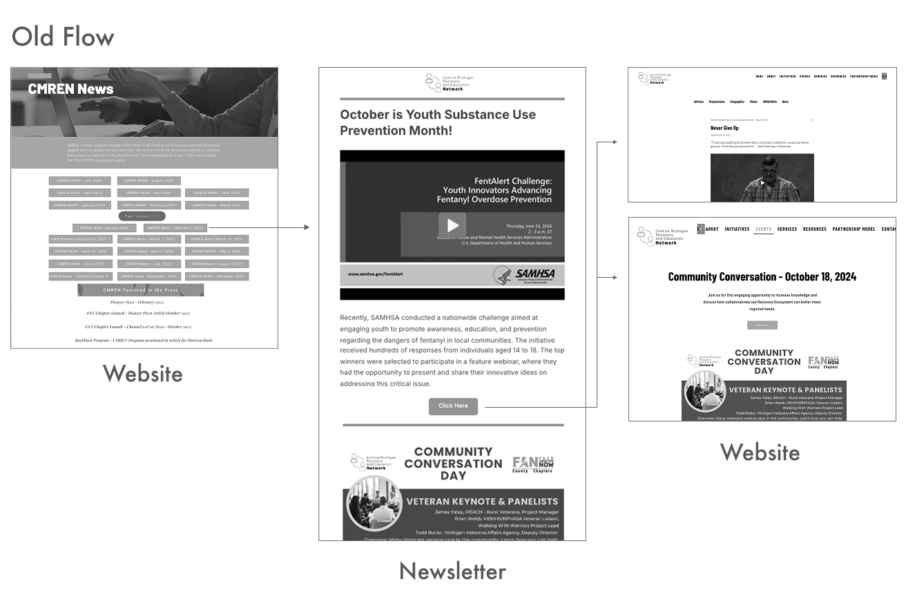
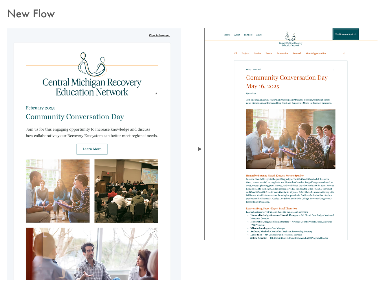
CMREN also sends out monthly email newsletters. The old system had a page filled with lists of links to those newsletters, which only links right back to the website.
The updated system simplifies this by directing all newsletter links straight to their corresponding posts on the News page.
RECOVERY RESOURCES
How it solves:
1. Clarity: All recovery resource information is centralized in one pop-up location, making it easy for individuals in need to quickly find the help they’re looking for.
2. Consistency: The use of Wix’s Store Mapper feature ensures that all maps maintain a consistent look and function across pages.
3. Sustainability: Resources can be easily added or removed through the map feature, along with any categories.
2. Consistency: The use of Wix’s Store Mapper feature ensures that all maps maintain a consistent look and function across pages.
3. Sustainability: Resources can be easily added or removed through the map feature, along with any categories.

MOBILE SCREENS
The mobile version of the website was developed alongside the desktop version, ensuring that all users (regardless of device) can easily access essential information and resources.