In-STore Research
I went into grocery stores and took pictures of the pasta shelves.
I went into grocery stores and took pictures of the pasta shelves.
Pasta Packaging Research
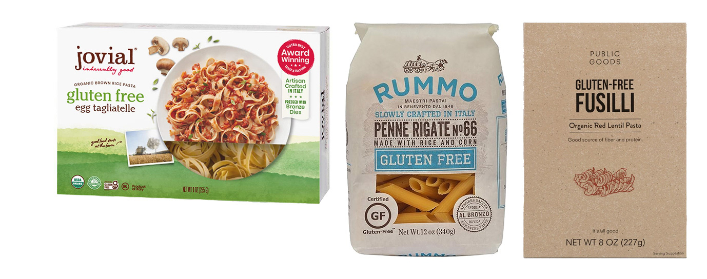
I also researched both regular and gluten-free pasta packaging. I discovered that many gluten-free pasta brands use a lot of brown, white, and green colors
I also researched both regular and gluten-free pasta packaging. I discovered that many gluten-free pasta brands use a lot of brown, white, and green colors
WHO is Cucina?
Cucina sells gluten-free pasta that tastes as authentic as traditional pasta from Italy. Each type of pasta’s package design is also inspired by blue Italian kitchen tile to represent its commitment to selling authentic pasta.
Cucina sells gluten-free pasta that tastes as authentic as traditional pasta from Italy. Each type of pasta’s package design is also inspired by blue Italian kitchen tile to represent its commitment to selling authentic pasta.
hi :)
Sketches
For my first sketching phase, I tested many different packaging shapes and designed themes from Italian dishware, tiles, and regions. The next phase was to test which theme would work the best, and I decided to try my Italian dish ware scene idea first.
For my first sketching phase, I tested many different packaging shapes and designed themes from Italian dishware, tiles, and regions. The next phase was to test which theme would work the best, and I decided to try my Italian dish ware scene idea first.
I then tested my second idea for the packaging to be based on Italian blue kitchen tile and having the packaging’s shape be similar to a coffee bag.
Iteration 1
For my first iteration, I create a version of my Italian dish ware idea; however, I decided against it because the complex imagery was not conveyed well.
For my first iteration, I create a version of my Italian dish ware idea; however, I decided against it because the complex imagery was not conveyed well.
ITERATION 2
I then decided to switch gears and test out my Italian blue tile idea and liked it much better.
I then decided to switch gears and test out my Italian blue tile idea and liked it much better.
Prototype 1
For my first prototype, I created mini versions of my packaging to test if my die-lines worked.
For my first prototype, I created mini versions of my packaging to test if my die-lines worked.
Prototype 2
The next one was full-scale. I considered having a white ribbon run at the top but decided against it.
The next one was full-scale. I considered having a white ribbon run at the top but decided against it.
Prototype 3
The next prototype was creating all the packages at full size, but I noticed how similar they all looked at a glance.
The next prototype was creating all the packages at full size, but I noticed how similar they all looked at a glance.
Prototype Testing
To solve this issue, I reworked the design of the packing to have the oval on the front be a window to see the pasta and have the folded tab contain the logo and text.
To solve this issue, I reworked the design of the packing to have the oval on the front be a window to see the pasta and have the folded tab contain the logo and text.
To test if this change was the better choice, I showed both the old and new version to friends and family. They liked the updated version best.
Prototype 4
After deciding to switch gears, I made a new prototype with the new design.
After deciding to switch gears, I made a new prototype with the new design.
Prototype 5
I then realized that the window on the fettuccine bag was too small, so I elongated it. I also tested different papers and chose glossy because its reflective like kitchen tile.
I then realized that the window on the fettuccine bag was too small, so I elongated it. I also tested different papers and chose glossy because its reflective like kitchen tile.
Final dieline
FINAL PROTOTYPES
Package Photos
In-store ADVERTISEMENTS
Display Shelf
